Leading with heart
Have you noticed something different about the General Mills logo?
Our refreshed logo features a red heart near the top of the familiar cursive “G”

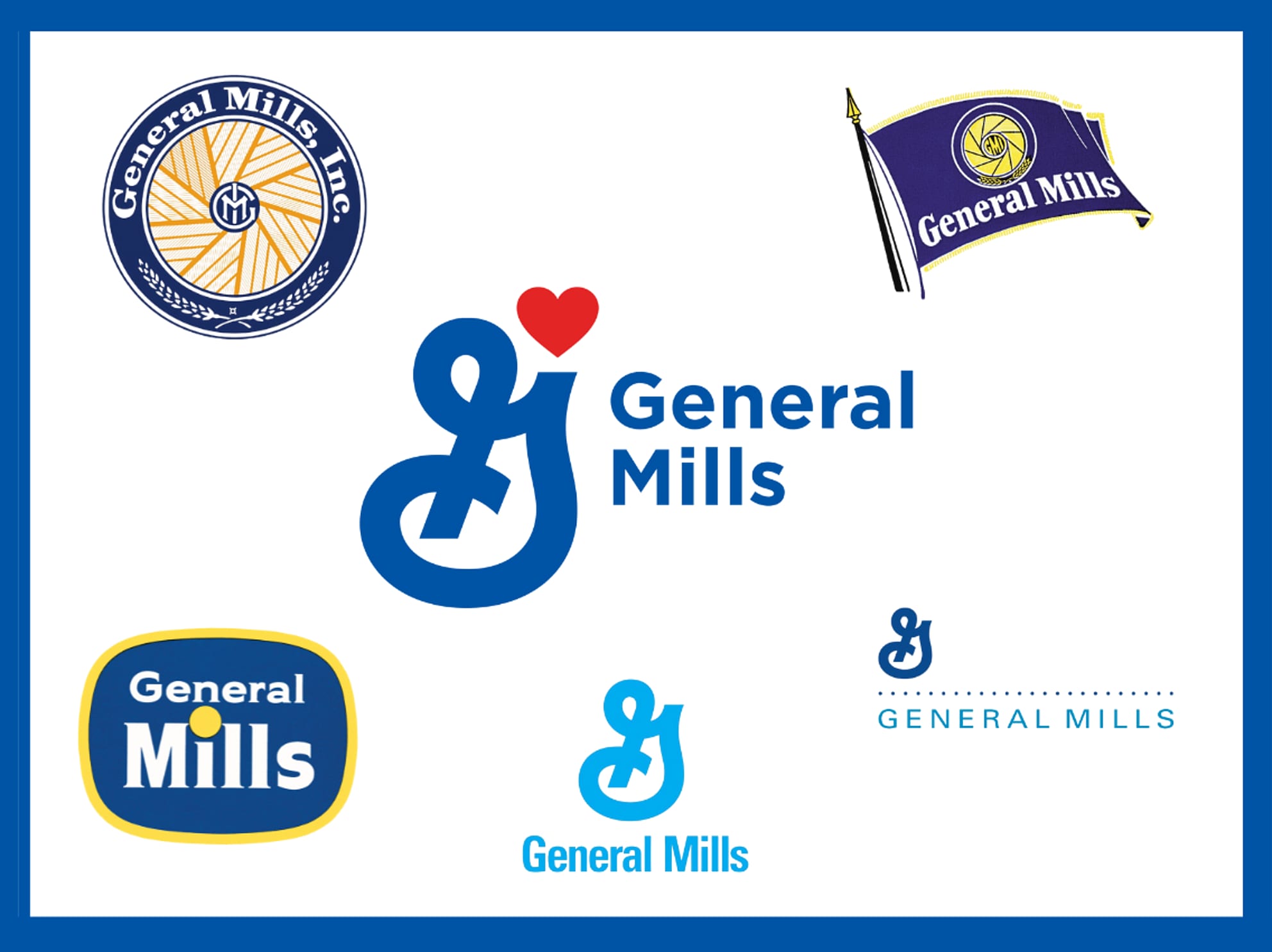
6 official logos
Reaction to our sixth official company logo has been positive.
One person told us, “It lets people know what General Mills has done over the years in a nice, direct way. It is what they have done for us as long as I can remember.”
Another said, “It’s bold, nice, straightforward and honest.”
After a first look, one of our employees said, “It reminds me of my family. It is something you can love and you can trust. Something I deeply care for.”
The logo has been appearing in places such as on our social media accounts and at worldwide locations. And check out the new flag at our headquarters.

Like our five previous logos dating back to 1928, when four milling companies merged to form General Mills, the new design builds on the company’s evolution.
It offers a modern look while staying true to our mission and heritage.
Here’s a closer look at how the logo has changed:
1928
We fully trace our roots to the formation of the Washburn Crosby Company along the banks of the Mississippi River in Minneapolis, Minnesota, during the late 1800s. At its core, General Mills was a flour company. So, it’s fitting that the first logo featured a millwheel.

1949
The second General Mills logo, portrayed as a flag, featured the company name and a variation of the familiar millwheel.

General Mills had evolved beyond a milling company by this time. Bisquick was introduced in 1931, followed by Kix in 1937 and Cheerios in 1941. Betty Crocker’s first cake mix (Ginger cake) debuted in 1947.
1956
With the rise of television, our third logo featured the company name on a blue, TV-shaped background.

General Mills was a pioneer, owning and producing television programming. We had an entire division dedicated to creating animated TV programs.
1963 – The “Big G”
The inspiration for our fourth company logo came from our cereal division. The first blue, cursive “Big G” appeared on a box of Twinkles cereal in 1960.


At the time, Edwin Rawlings was president of General Mills. He wanted something just as simple as the “Big G” for a new company logo.
“As General Mills continues to grow,” Rawlings said, “it becomes increasingly important to establish the use of a single, consistent, graphic corporate symbol which will register immediately, and favorably, upon customers, stockholders, suppliers, farmers, labor and people in the business and financial world.”
General Mills turned to Lippincott & Margulies, the New York advertising firm that had created the red Betty Crocker spoon in 1954. The agency modified the cereal division’s “G” to capture the strength that General Mills projected. The outcome was the current “G.”


2001
After General Mills acquired Pillsbury in 2001, we revised the company logo a fifth time to reflect both companies. The familiar “G” changed color, adopting the rich, deep blue of Pillsbury. A series of dots – derived from the Pillsbury “barrelhead” logo – was added to symbolize the continuing growth and progress of the General Mills brands.


